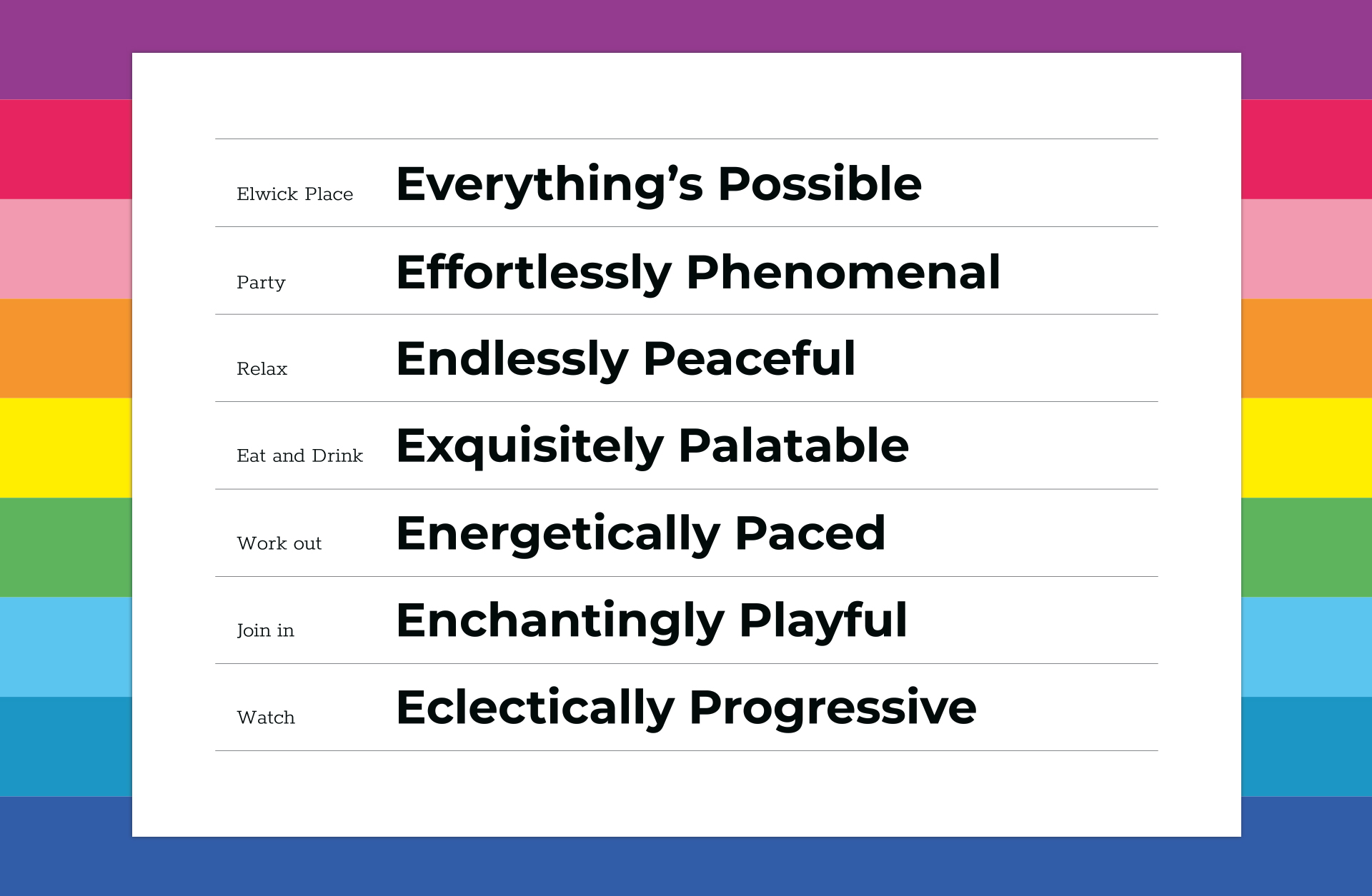
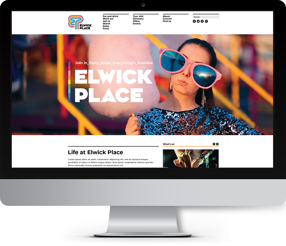
Elwick Place
The vision was to inspire a large footfall to Elwick Place – a development comprising the first ever new-built Picturehouse cinema, retail/restaurant units, a 24 hour gym, a Travelodge hotel and Elwick Place Piazza (a brand new outdoor event space).
The brief was to engage the people of Ashford and surrounding areas to see Elwick Place as a premier hotspot for leisure activities.
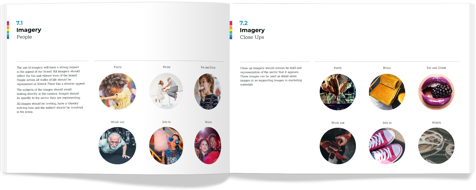
The messages had be positive, vibrant and inclusive so people felt that Elwick place has something for everyone and is a place where they can party, get involved and relax.
Client
Ashford Borough Council
Deliverables
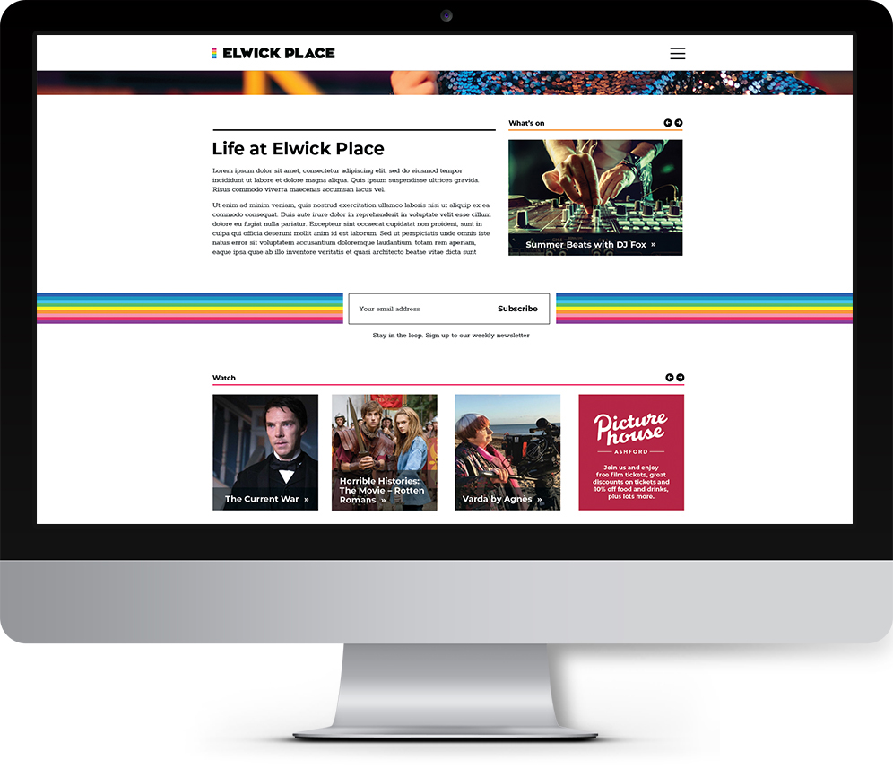
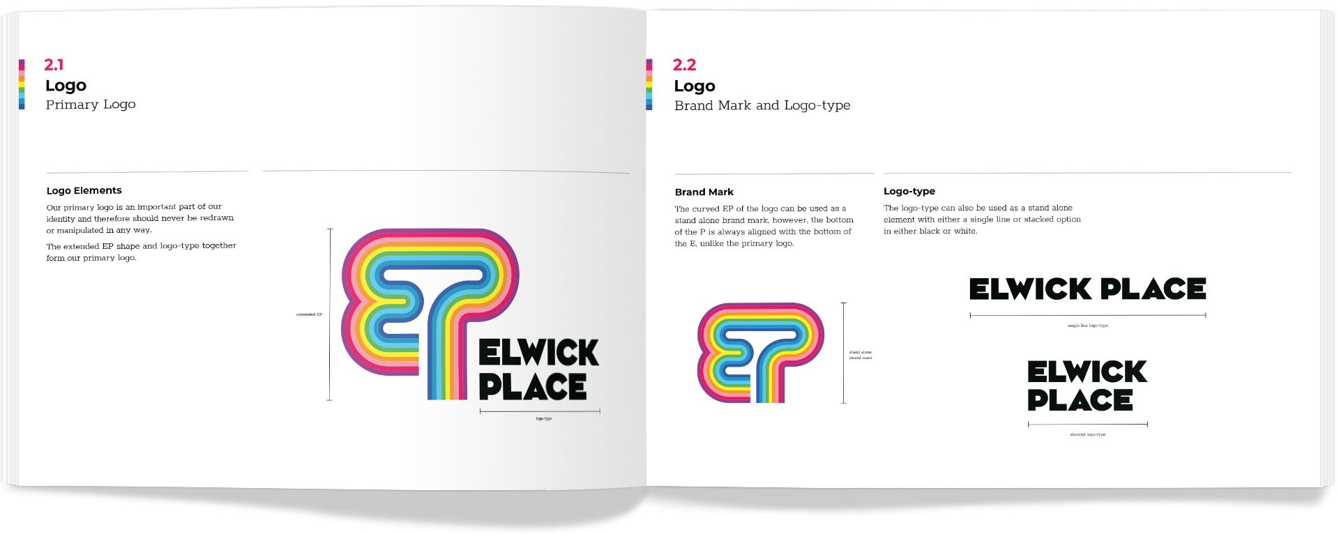
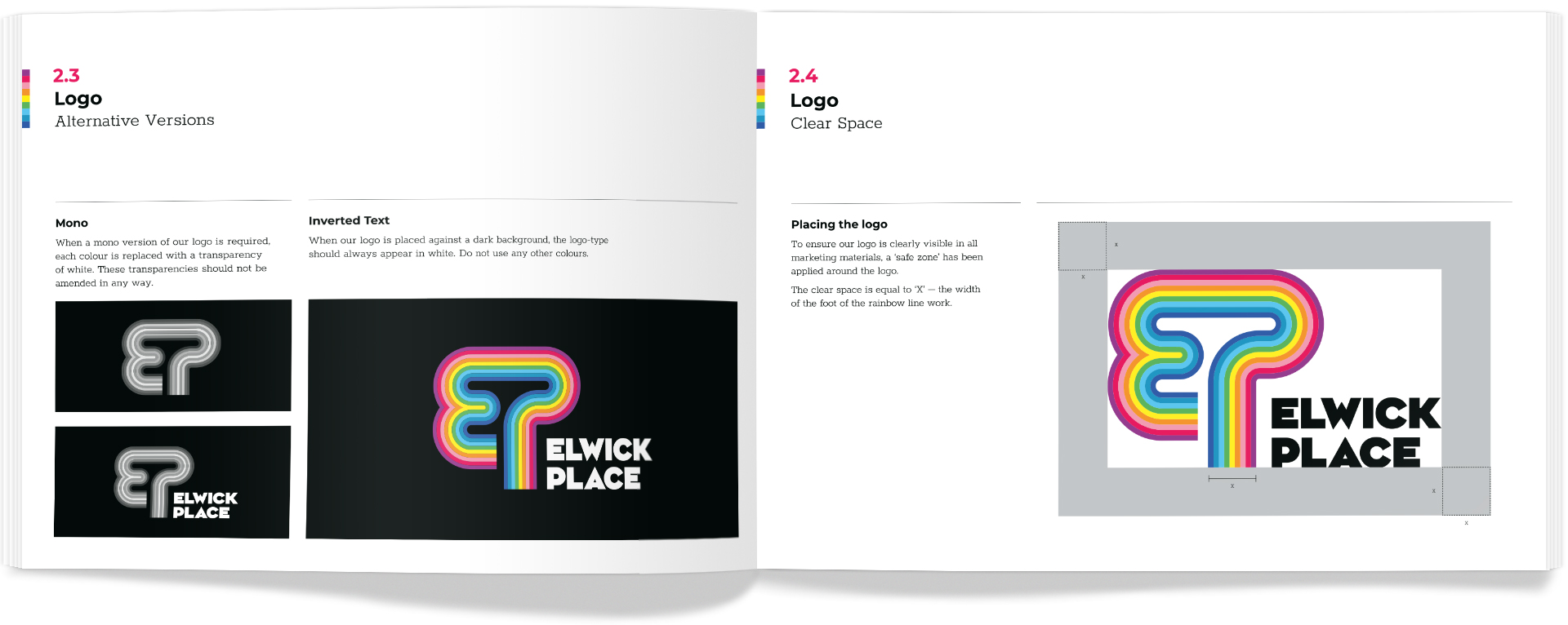
Brand guidelines, full brand toolkit, and web design (with super and sticky navigation examples)

Inspiration
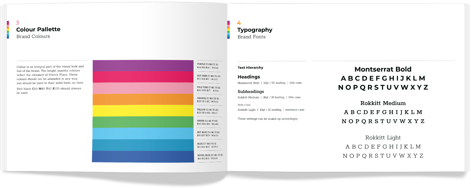
The brand is inspired by the heritage of the Letraset font foundry in Ashford, as well as its major transport links via rail, sea and land The curvature of the line work that guides the viewer to ‘Elwick Place’ and the harsh, abrupt end to the lines represents the arrival at Elwick Place.
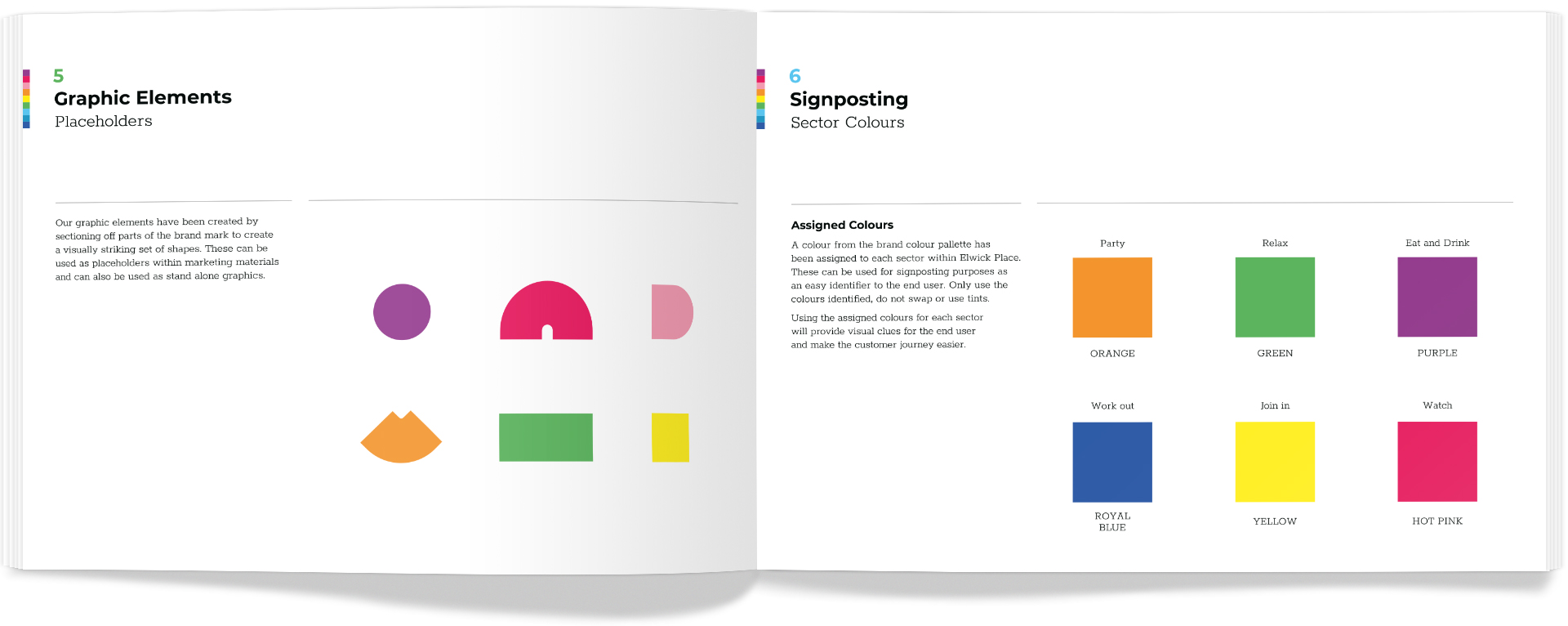
The EP formation of the line work stands alone as a tree shape – Ashford is partly named due to Ash Trees – and as trees lay down their roots to survive, such is Elwick Place laying roots for the community to come together to thrive.